
As part of the wider effort to support store-specific planograms to deliver more localised ranges tailored to customer needs and behaviour, decommission the third-party platform, and bring together multiple scattered tools and manual processes into a single system, we developed myProduct: Merchandising.
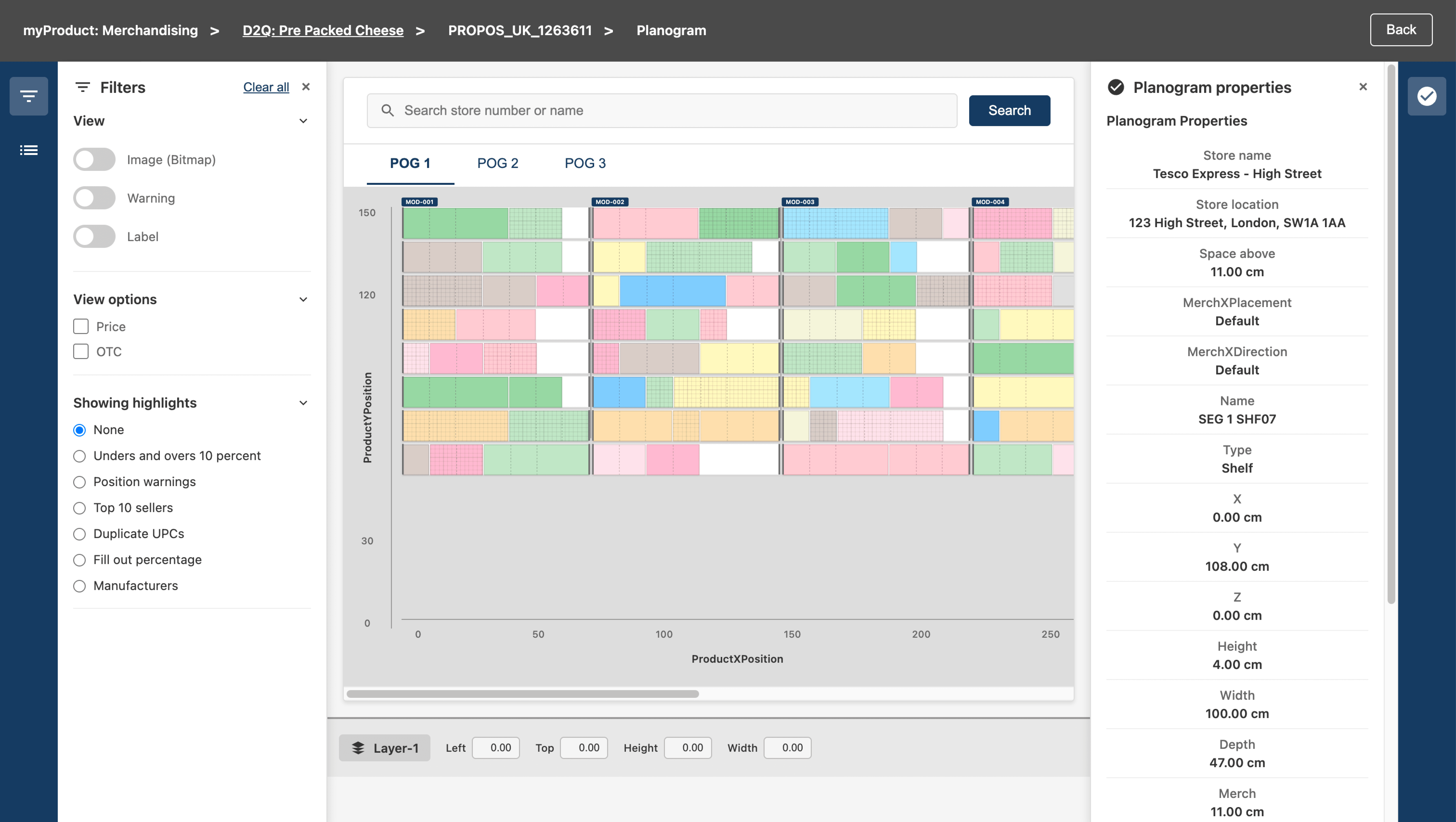
A core feature within myProduct: Merchandising is Planogram Visualiser, which enables users to view, review, and assess planograms directly within the platform, supporting faster decision-making by giving them access to the key information they need without relying on external tools.

Tesco Technology
UX Designer
Discovery to Design
Measuring Success
Lessons learned
Figma
Challenges
Assessing the current process, needs, and issues while shaping a future solution and balancing today’s way of working with future needs.
Understanding the full merchandising process and breaking it into manageable parts for iterative delivery.
Providing the right amount of functionality for users to confidently review planograms without turning this platform into another complex tool.
Having access to many users of the legacy process, but few users of the new process
Results
Designing with the bigger picture in mind, I ensured each feature we built could scale and evolve, avoiding the need to rework the foundation as new capabilities were introduced.
Introducing a lightweight, purpose-driven canvas experience while covering enough functionality to understand and validate a planogram.
Clarity over feature completeness
Using the knowledge of both types of users and turning them into valuable insight for shaping the future

Discovery to Design
Problems & Opportunities
We knew that as part of the process for analysing store-specific planograms, users need an interface that allows them to see and understand planograms visually, while being able to do related tasks. Yet what we didn’t know:
We didn’t know how users perform these tasks
What functionality they needed
What problems they currently face, and how they are handling them
Since we can’t have all the functionality at once, which ones should we start with


The new system aimed to:
Automate parts of the planogram creation process using science
Enable store-specific planograms at scale
Reduce manual effort and reliance on Excel workflows
Provide a single platform to manage, review, and validate planograms
Defining Tasks and Validation
To move forward, I conducted user interviews and analysed how users worked with the current system, identifying the features they relied on, how they navigated their tasks, and what they truly needed to perform their job effectively.
This was a combination of understanding the existing tool, the overall process, and user journeys, while simultaneously defining flows and experiences for the current tool.
Mapped the end-to-end merchandising process
Defined user roles and responsibilities
Key journeys and interactions
Created a sitemap and system architecture
Conducted competitive analysis


Test and Implementation
To define the features and functionality, I began exploring early concepts through prototyping (including lightweight “vibe coding”) to assess what would be technically achievable.
This approach helped the team build a shared understanding of each feature, its behaviour and interactions, while enabling faster iteration, continuous user testing, and ultimately refining the solution into a well-defined final design.
From there, we moved through multiple phases of exploration, including ideation sessions with engineers, evaluating different options, and testing solutions with users, ultimately refining these into a final, validated design.
Early-stage prototype by vibe coding
Going through details and different versions
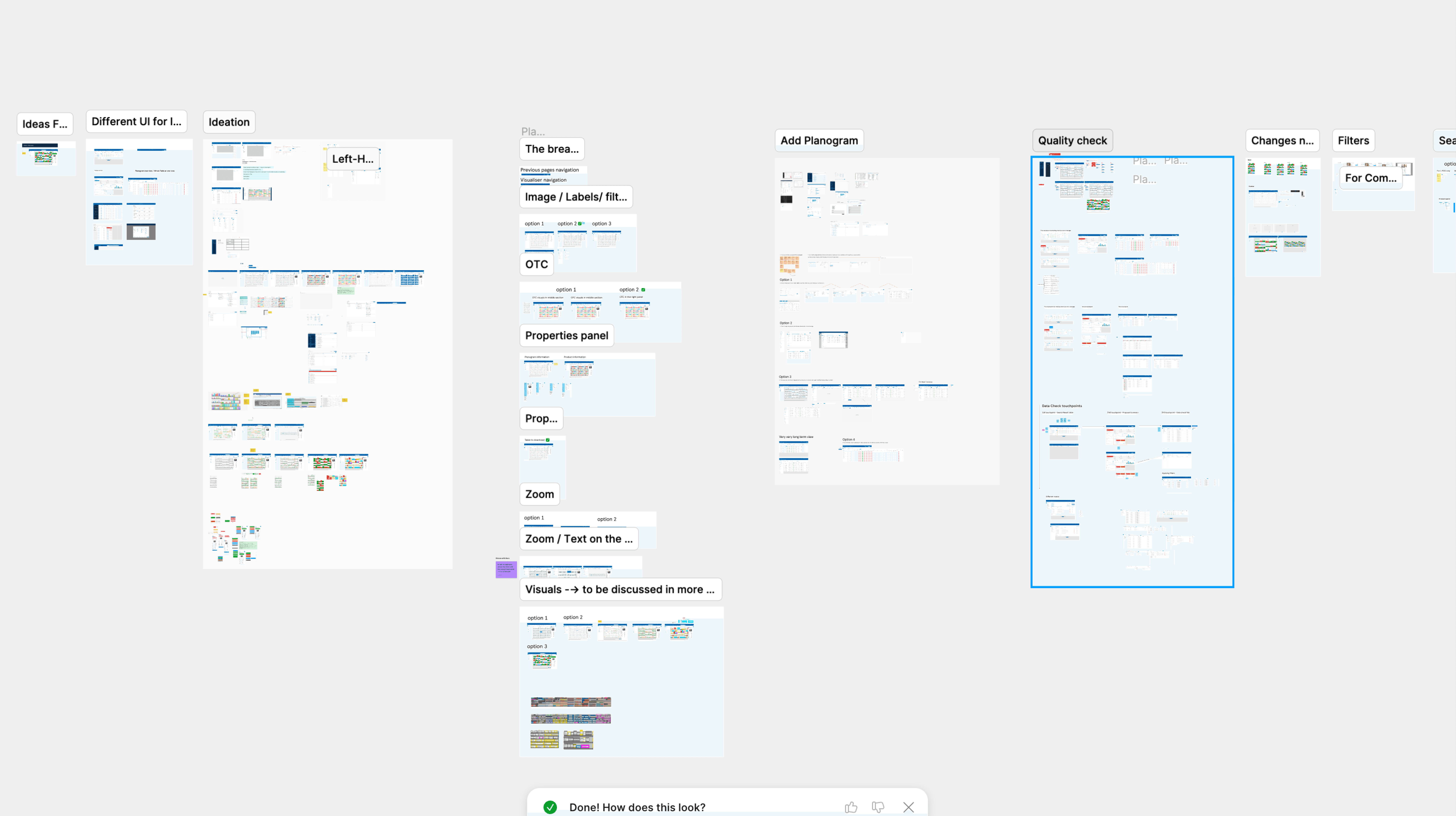
Learn and Iterate
Each feature we worked on went through continuous cycles of:
User feedback sessions
Iterative testing of different solutions
We continuously refined the experience based on real usage and feedback.
Rather than following a strictly linear process, the work evolved in an iterative loop, moving between discovery, design, and validation. At times, this meant revisiting previously delivered features, refining them based on new insights, while simultaneously designing new ones.
The key driver throughout the process was ongoing iteration and learning, ensuring that each improvement was informed by real user behaviour and feedback.
A snapshot of the final design

Measuring Success
Regular monthly feedback sessions with users.
During these sessions, we focused on understanding how they interacted with different parts of the product, identifying any challenges they faced in their day-to-day work, and measuring their confidence in using the system.
Currently, the average confidence level is 8.5
Quarterly usability survey to track user satisfaction over time.
Rather than treating this as a purely quantitative measure, the goal was to identify trends, understand changes in user sentiment, and continuously improve the experience based on ongoing feedback.
My Learnings
The real problem is often behind the visible interface.
Strong discovery and system thinking are critical for success.
Designing with the future in mind can significantly reduce long-term complexity.
Simplicity and structure have more impact than feature richness.