
Designing Search Functionality for Mortgage System
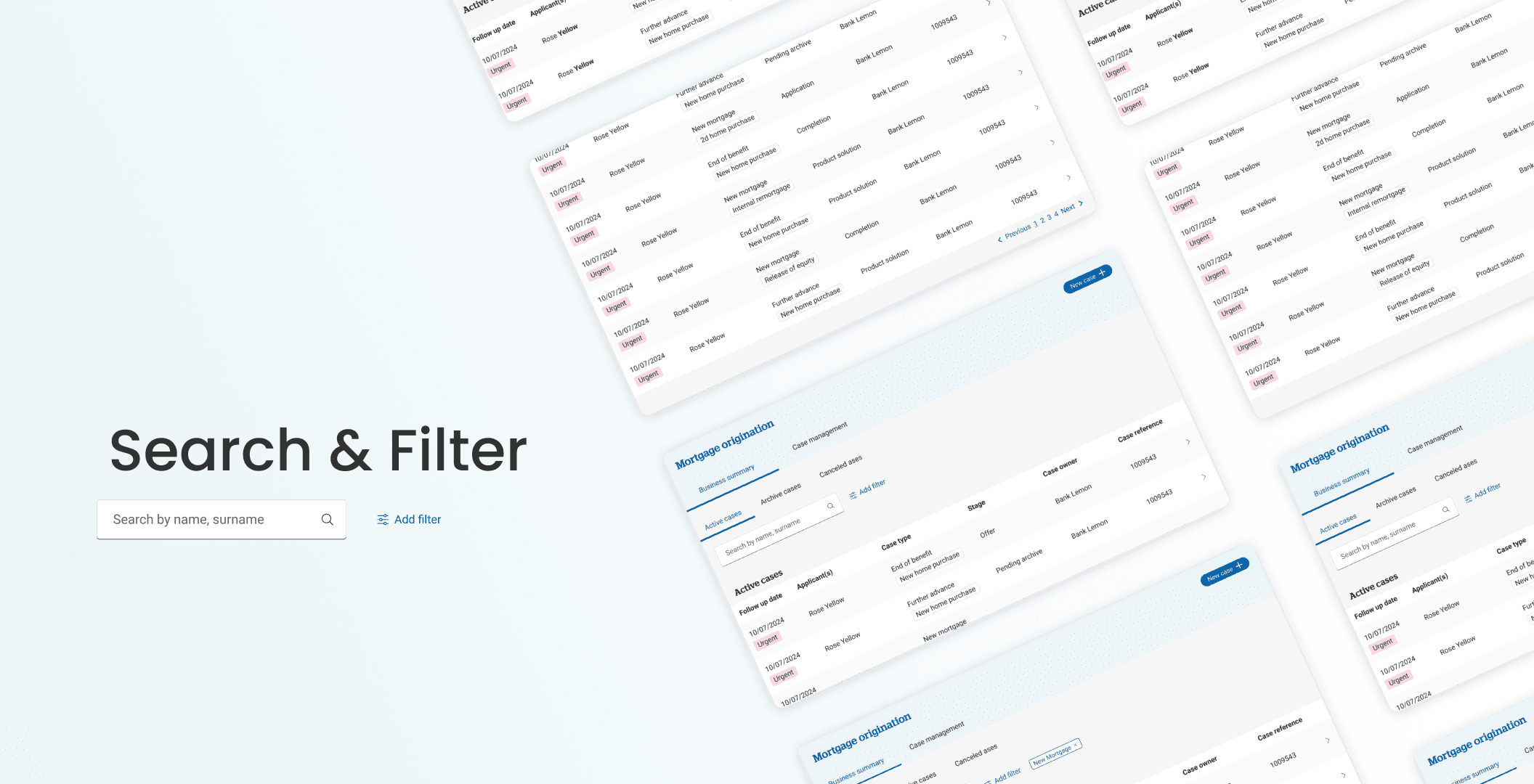
Mortgage advisors and private bank managers faced difficulties navigating and managing mortgage cases efficiently within the system. The lack of effective search functionality, filtering options, and clear organization resulted in a time-consuming process, reducing productivity and impacting customer service quality.
Handelsbanken, London, UK
UX Designer
Research & Analysis
Competitive Analysis
Wireframing and Ideation
Design Solutions
Usability Testing
Final Design
What I Learned
Figma
Challenge
Aligning Stakeholders: Balancing differing priorities and opinions from stakeholders while keeping the focus on what users needed most.
Tight Deadlines: Dealing with a sudden project addition that left little time to prepare or plan.
Iterating on Feedback: Tackling issues uncovered during user testing, which meant refining designs multiple times to get them right.
Team Coordination: Collaborating with different teams to ensure progress while juggling technical limitations and business goals.
Results
Aligned Priorities: Collaborated with stakeholders and developers using discovery insights to balance user needs with business goals.
Faster Searches: Added search and filter options, helping users find cases quickly and easily.
Positive Feedback: Users loved the new filtering features, saying they made searches much simpler.
Time Saved: Cut processing time by 25%, making workflows smoother and faster.
Better Usability: Improved design made tasks easier and more enjoyable for users.


Research & Analysis
Conducted user interviews with 5 key stakeholders, including Private Bank Managers and Mortgage Advisors, to understand real-world usage and challenges.
Key Findings:
At Handelsbanken, mortgage advisors and private bank managers using the mortgage system faced significant challenges finding their mortgage cases.
The system was hard to use and time-consuming, impacting advisors’ productivity and their ability to efficiently manage customer interactions.
Users encountered disorganized search results, especially when searching for common surnames, which led to multiple pages of unordered cases.
Not having functionality to search with both the applicant’s first name and surname, which made it difficult for users to find the exact applicant
No filtering options forced users to manually sift through extensive data to locate specific cases
Lack of differentiation between case statuses (active, archived, canceled)
Competitive Analysis
Competitive analysis helped identify search functionality and behavior in different industries and potential improvements.

Wireframing & Ideation
Following the discovery phase and competitive analysis, I developed several ideas and solutions to share with key team members, including the business analyst and product owner. Together, we analyzed each option, incorporating input from developers to weigh the pros and cons and explore additional possibilities. This collaborative process led us to a refined final draft.

Design Solutions
The final design delivered optimal value to users and the business, emerging from collaborative sessions with developers, business analysts, and user feedback. This solution effectively addressed user challenges while aligning with business objectives, balancing the need for rapid delivery with a focus on maximizing impact.
Problem: Going through multiple pages to find the proper case
Solution: Splitting different case statuses to show more cases in one view

Previous design

Problem: 2 or 3 Pages of search results with no order, not being able to find the exact case looking for
Solution: Showing search results by grouping them in different tables based on applicants’ names, and sorting cases based on the most recent one in each table


Problem: No option to filter the table or the results shown to the user
Solution: Adding a filtering option and keeping it visible


Usability Testing
Testing design solutions with users resulted in some changes to the logic and flows.
We had 2 options for search functionality, one to search only for applicants, grouping the results by the related applicant name, and a second option to have a generic search, which led us during testing to choose a generic search that covers all the data in the tables
Having sorting options for some columns, like Case Owner, Case Type, and Mortgage Stage
Changing Case reference number with GBID number, the reason was that for users the case reference number was not useful since it was only applicable to this system, but the GBID number was more useful across different systems, such as CRM data.
There are times when we have more than 3 applicants, and with truncation, they won’t all be visible while searching, so decided to change order of applicant in case third applicant is being searched.
Final Design
What I Learned
Small changes can drive significant impact: I learned that even incremental updates can enhance the user experience and solve critical pain points without overwhelming the team or users.
Breaking features into manageable chunks: Delivering features step by step ensures smoother implementation and allows for adjustments along the way while still achieving the final goal.
Early engagement with developers is key: Collaborating with developers from the initial stages keeps them informed, ensures feasibility, and minimizes the risk of additional rework during the development phase.